On a mission to hone my craft as a designer, I decided to try out the Daily UI Challenge, which is an email newsletter that sends me daily UI challenges.
Challenge #1: Sign up page, modal, form or app screen
My first challenge was met with foundational graphic design principles - color theory. I learned the color lingo (hue vs chroma, tone vs shade vs tint) and tools (color scheme and palettes) to communicate and evoke emotions.
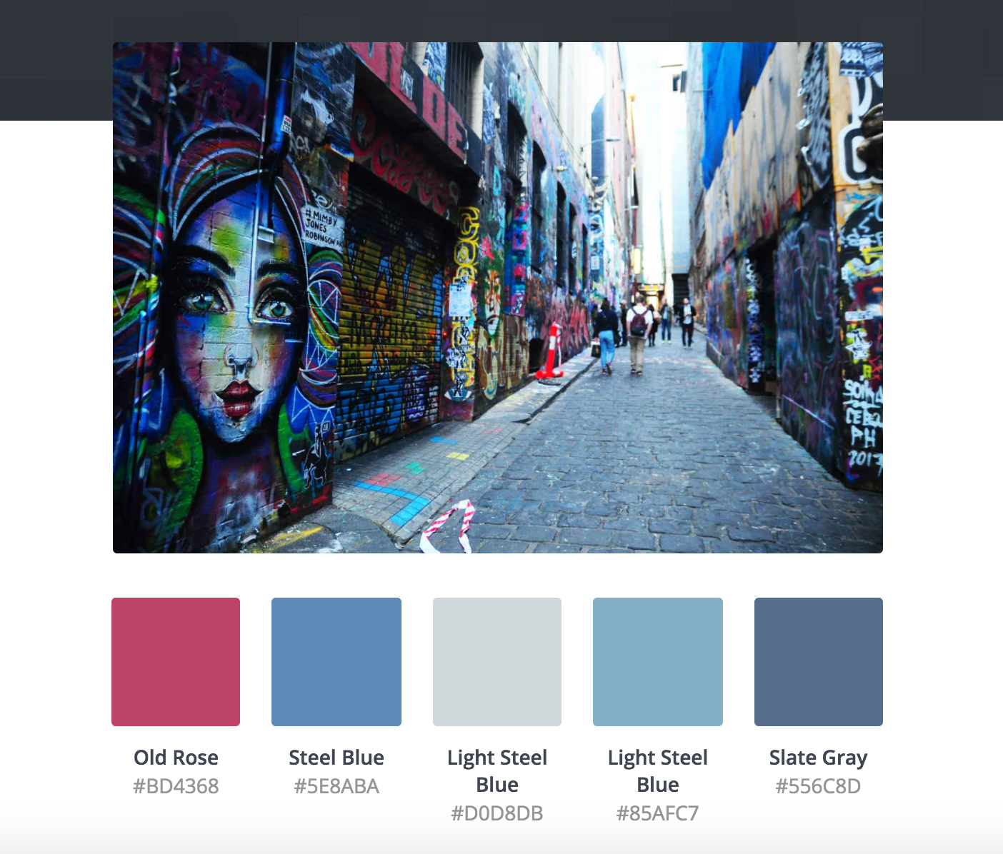
I decided to design a sign up screen for one of my recent trips in Melbourne to discover street grafitti art and laneways. After experimenting with several color schemes, I settled on the below to communicate the idea of fun, spontaenity and discovery based on the picture captured from my trip.
The final design
Color palette generated from Canva
Challenge #2: Credit card checkout form or page
First thing that came to mind was designing for travel activities checkout, mostly inspired by my recent read on The Airbnb Story. I decided that a static jpg wasn't enough to communicate the series of interaction from punching credit card details to confirming the order. As a first step to motion and interaction design, I used Keynote to prototype it.
For this challenge, I learned about the importance of contrast, alignment, proximity and white space in visual hierarchy. I specifically designed for the desktop experience and decided that the Rule of One Thirds would serve as the best placement for the checkout interface as users look down on the waves.
When animating the responses to user actions (ie. press a button, type a number), I learned that even a subtle 50ms makes a difference in perceiving states (ie. processing vs processed).
Challenge #3: Calculator for Numbers, Mortgage or Anything
Given that I used to work at a travel loyalty program, the first calculator that came to mind is on the number of miles traveled. In response to emotion design, I wanted it to be a milestone calculator and about celebrating traveler's moments.
This time, I focused a lot more on the nitty gritty part of creating vector art using Adobe Illustrator and then mocking it up with HTML/CSS. I learned to design with gradients, which uses mostly analogous colors. And gradients are tricky. The gradients' directions matter and when you have more than one set of gradient, the visual pairing is quite a test-and-learn. I also learned to design create depth with shadows and reflections for the mountains, hot air balloon, clouds and the sky. I gotta say, gradients are so much fun to look at!
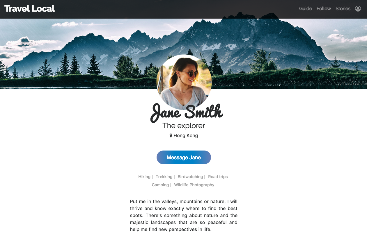
Challenge #4: User Profile - Serious or Social?
The layout this time is quite straightforward - username, CTA, interest clusters and a short description. Visually, the background image and profile picture was the most difficult pairing. The user photo I chose has a very warm, yellow tone and I wanted the background image to contrast but not overwhelm the user photo with too much details in the background.
In terms of tools, I wanted to improve my responsive web design skills, specifically the Bootstrap navbar responsive hamburger menu and navbar color change when scrolling.